Design Research IV: Final Products

Final presentation slides: https://docs.google.com/presentation/d/1mA8Nu4ou7VaIU6BRnL-GnCK2QLyey8YkE5ECl2M8Irk/edit?usp=sharing

This week we updated our design and here are the final renderings:

Interactive Website to help find the best medium

Screen Shot 2020-12-11 at 1.16.23 AM.png
Screen Shot 2020-12-11 at 1.16.33 AM.png

Walkthrough video

I changed the website to match Irwin’s design and also updated some choices, logic and calculation. I also added more illustrations to match the card deck.

Screen Shot 2020-12-08 at 3.57.05 AM.png
Screen Shot 2020-12-08 at 4.02.06 AM.png
Screen Shot 2020-12-08 at 4.02.19 AM.png

There are nine questions in total. Each choice comes with a score, and the website will automatically add up scores to generate a recommendation for medium and tools.

Based on the calculation, there are three kinds of recommendations:

Screen Shot 2020-12-08 at 2.45.42 PM.png

If the total score is less than 10, then the medium recommended is traditional media, such as books, comics, zines, etc.

Screen Shot 2020-12-08 at 3.48.47 AM.png

If the total score is lower than 39, then the medium recommended is motion pictures such as film, documentary, TV shows, short videos, etc.

Screen Shot 2020-12-08 at 3.48.58 AM.png

If the total score is higher than 40, then the medium recommended is interactive storytelling tools such as VR/AR/MR.

Screen Shot 2020-12-08 at 3.49.09 AM.png

Poker Card for Creators

WechatIMG1697.jpeg
WechatIMG1696.jpeg
WechatIMG1698.jpeg
A pack of 52 cards created by Irwin

A pack of 52 cards created by Irwin

Prototypes

We printed out two sets of cards for the prototype. The first set was printed as glossy photos:

IMG_7112.jpg

I printed them out on 4X6 photo paper and cut them with the paper cutter in the IDM Proto Lab.

IMG_7114.jpg
IMG_7115.jpg

The photo became curly right after I cut them, and the ink was blurry too.

So Will printed another set on thick paper which looks much better:

Image from iOS (6).jpg
Image from iOS (3).jpg
Image from iOS (5).jpg
Image from iOS (4).jpg

Eventually, we will print them out as real poker card.

USER TESTING

For website:

Jacob, Independent Filmmaker

I want to know more about which interactive tool I should use. Right now the website only tells me VR/AR/MR, but which one is best for my project?

Ailin, Interactive Artist

I think there are more tools and mediums than what you suggested on the website. How about the combination of both traditional and innovative technologies?

For poker cards:

Darren, Brand Strategist, ADPR

As an Advertising student, I think the set of poker has such important educational and aesthetic significance. First, each poker card represents an industry term or project process that allows students or entry-level practitioners to understand or familiarize themselves with real-world cases quickly. Then, a modern and clean design can lead to better visual experience and user interaction. I believe this is a win-win design that allows users to be immersed in entertainment and also learn something.

Stacy, Student majored in Media Studies

As a student with a background in media studies, I think the set of poker has a clear hierarchy. Each poker card has a symbolic pattern to reflect the key words, which is very friendly to media students like me who don't like to read long sentences. And each poker summarizes a short quote, it is easier for users to read the above content to find inspiration when using it.

Reflections

Based on our user’s feedbacks, we should update our designs:

  • For the poker cards, some text will be better with a different color and bold.

  • For the website, it will be more helpful with more questions and a better calculation system to provide more specific recommendations.

  • A third step to help brainstorm how to use the tool(s) or even break rules. Think more about the content and format, and how a simple tool can also bring a brand new level of experiences, like radio can also be used as VR.

Design Research III: Website mockup

This week, our team (Irwin Qi, Will Politan, Rani Qiaochu Kang, and I) conducted more research on our stakeholders, created personas and mock-ups for our topic: helping creators to choose the best medium for storytelling.

Personas

The three stakeholders we picked are student, filmmaker, and artist.

student vlogger.jpg

Jessie

Age: 25

Occupation: Student

Interest: Jessie loves making vlogs. She films herself whenever she is on campus and hanging out with friends.

Pain point: Jessie wants to be more than just a YouTuber. She wants to create more interesting contents and gain more fans.

filmmaker.jpg

Jake

Age: 31

Occupation: Filmmaker

Interest: Jake is an independent filmmaker. He makes a living creating commercials for a variety of clients on social media.

Pain point: Jake’s clients want the commercials to be more engaging than just a 59 sec video clip on social media. Jake wonders if there is a better way to create interactive content that attracts more views and impressions.

Black-Female-Artist.jpg

Jojo

Age: 36

Occupation: Street artist

Interest: Jojo is a street artist who creates graffiti addressing on social justice and political issues.

Pain point: Jojo wants to create more impacts with public arts. She wants her artwork to be powerful and mind-blowing that raises awareness on certain topics.

Brainstorming on ideas

Here’s a user story map for our three personas:

A user map created by Miro: https://miro.com/app/board/o9J_leo5cnI=/

A user map created by Miro: https://miro.com/app/board/o9J_leo5cnI=/

We finally picked two ideas to help our personas with the creative thinking and storytelling production:

  1. A pack of poker cards to help brainstorm the stages of production and medium;

  2. An interactive website to help creators sort out their preferences and conditions for their projects.

Poker card mockup

We created a list with 52 terms for the poker card with four categories: https://docs.google.com/document/d/1Z2za9Cj9qnPLtkVlc51v8mJQTrp0rjtO2IuIoWeNDEg/edit?usp=sharing

The 52 items are:

PRE-PRODUCTION

  • Script writing

  • Interview

  • Storyboard

  • Recruitment / Casting

  • Drafting

  • Character design

  • Financial / investment

  • Location Scout

  • Order production insurance

  • Create equipment list

  • Production planning

  • Table-read

PRODUCTION/PROTOTYPING

  • Creation of assets

  • Building infrastructure

  • Filming / Cinematography / Photography

  • User research/ User experience

  • 3D modeling

  • Rigging

  • Animation

  • Drawing / illustration

  • Motion Capture

  • Iteration

  • Wireframing

  • Curation

POST PRODUCTION

  • Editing

  • VFX

  • Sound design

  • Color grading

  • Distribution

  • Advertising

  • Marketing

  • Review

  • Screening

  • Rating

  • Testing

  • Publishing

CHANNELS

  • Traditional print media

  • Small print materials

  • Outdoor advertising

  • Broadcasting

  • Website

  • Videos

  • Movies

  • Apps

  • Social media

  • VR

  • AR

  • MR

  • Games

  • Physical Space

  • AI

Poker mockup created by Irwin

Poker mockup created by Irwin

Poker cards created by Irwin

Website mockup

We decided to create a questionnaire like a personality test to help creators choose the best medium that fits their needs.

Here’s a question list drafted by Rani: https://docs.google.com/document/d/12Tng2Hc0nKf4xZIf3bJiW-wiUMdmsWnzyHJGsWBrB5U/edit?usp=sharing

I then used Typeform, the website that Will recommended, to create a mockup interactive website.

Here’s a draft on the website framework:

Screen Shot 2020-12-01 at 4.37.39 AM.png
Screenshot of the question editing process

Screenshot of the question editing process

Screen Shot 2020-12-01 at 3.41.58 AM.png
Screen Shot 2020-12-01 at 5.42.54 AM.png
Screen Shot 2020-12-01 at 5.43.16 AM.png
Screen Shot 2020-12-01 at 5.43.35 AM.png

Here’s a video about how this website works:

User Experience

Example use case drafted by Will:

Jake: Independent filmmaker in his 30’s creating commercials for clients. Jake wants to take his filmmaking to the next level for social engagement that goes past traditional methods. He sees augmented reality potentially as a budding industry and great opportunity for more viewership/interaction. The problem is the pipeline for augmented reality is quite different than that for traditional filmmaking. Also, is augmented reality going to be the best medium? Or would virtual/mixed reality or something else be closer to his goals.

Jake starts with our questionnaire website:

He has to answer a number of questions ranging from how you want your product to be experienced, what is the budget, and who is your target audience.

Based on these questions we will make a “best case” suggestion. This will either solidify or potentially change his ideas up to this point. Once a decision is made on the target audience and medium, it’s time to plan out the shoot.

Jake must break his shoot down into our four categories of pre-production, production, post-production and channels. Here he can use the design deck to flesh out all of the details for the medium he chooses. He will pick the corresponding cards that fit the medium and begin to flesh out the shoot armed with more confidence and preparedness.

We still need to do more user testing and figure out how to make the process more informative and intuitive for our stakeholders.

Design Research II: Communication Medium

Our group (Irwin Qi, Will Politan, Rani Qiaochu Kang and Jude Zhu) decided to create a guidebook / sorting website for filmmakers, creative directors, sport professionals, and students.

Stakeholders

Thanks to Irwin, we have a list of our stakeholders:

Creative Director

Creative directors serving for advertising agencies usually need to pick the best channel or select certain media for the advertising campaign. While traditional media like newspapers or magazines are straightforward and easy-to-understand, the emerging media is a combination of confusion. Example like, virtual reality and mixed reality requires speciality headset and limited accessibility for certain user groups, the augmented reality could be easily accessed by user through Apple or Google’s ARToolkit. Also most agencies lack programmers so they don’t have the resources to create AR apps without outsourcing.

Students

Learning the difference between mediums and how to utilize it better. Learning to develop software and hardware related to the field. Students will also take classes with MR, depending on the circumstances and subjects they are taking. This can be very useful for those who can’t be physically present.

Filmmakers

Filmmakers and artists will continue to experiment and use these emerging technologies in their work. Those looking to tell their stories in new mediums such as VR, AR, and MR could use our system to decide which is the best approach to go with. Many traditional visual stories could be converted to these new mediums and these cards will help facilitate that process.

Artists

Artists can paint now in 3D, but they must use the VR headset to do so. There would be some new art forms, not necessarily related to filmmaking. Not necessarily replacing the traditional way. VR can also be used in the fashion industry to see what a piece looks like on someone before making it. Saves a lot of material, but might take more time in prototyping.

Sports

Sport games. Sport practices. Saves much space. Can practice anywhere. To some extent the effect of practicing with VR should be the same, but might lack an atmosphere.

Research Methods

We then chose Interview and Survey as our research methods to know more about our stakeholders.

This is the survey Rani created for students: https://forms.gle/7XPPmALT2vJz1Bh88

Screenshot of Rani’s survey for students

Screenshot of Rani’s survey for students

Based on the responses we received, Will created an amazing interactive graph to visualize the data: https://infranodus.com/wpolitan/google_201124T1658

Will created an interactive graph to visualize our survey results.

Will created an interactive graph to visualize our survey results.

I then conducted some interviews with the stakeholders. These are some quotes about why they use VR/ AR/ MR for their field.

1539018024628.jpeg

Girish Balakrishnan

Director, Virtual Production at Netflix

Netflix’s NLab is making huge efforts in content production with emerging technologies. I believe that we are at the dawn of a new age in cinematic production, where innovative technologies merge in new and unique ways to produce truly immersive experiences. My passions lie at the forefront of this virtual production revolution, constructing tools that push this medium into uncharted territories.

0.jpeg

Shari Hanson

Senior Vice President, Physical Production

at Paramount Pictures

Virtual production is faster and cheaper for filmmakers. We can see some great effects before we actually go film them or create them with big CG teams. It helps a lot with controlling the budget and can bridge the director and director of photography better.

1521499989219.jpeg

Edward Saatchi

Founding members of Oculus Story Studio

Emmy winning Cofounder at Fable Studio

I have spent years exploring how VR can be used to make narratives more immersive. But I think the future of storytelling doesn't lie in VR movies. We should admit that VR movies are not going to replace cinema. Instead of trying to mimic the experience of films through virtual reality, I believe there's even greater potential in designing realistic characters for AR and VR. Imagine a virtual companion that can learn over time and interact with you and your family naturally.

Screen Shot 2020-11-24 at 3.53.33 PM.png

Lauren Owen

Creative Technologist and Tech Education Instructor, IDM class 2020 student

I built an augmented reality experience to commemorate the lives of Black women lost to pregnancy-related deaths. I also designed accessible Morse Code learning games for children with disabilities to managing the digital products of one of the world’s largest membership organizations. I enjoy finding creative ways we can do the unexpected and truly be innovative effectively and efficiently as well as reading, baking vegan sweets, and playing scrabble.

1531449666230.jpeg

Abe J. Brody

CEO of AR Marketing/VR Entertainment/OOH/Sports Gaming at Everpresent Media Studio

By utilizing our Augmented Reality, Virtual Reality, and studio post-production divisions, we precisely focus on each of our client's specific needs. No matter how large or seemingly small they may be. We can package these unique features with our traditional and alternative OOH marketing mediums. This enables our clients the ability to maximize the number of valued impressions per marketing dollar. We also focus on Entertainment and Sports Gaming Marketing. Our goal is to implement a fascinating AR/VR experience that allows for a unique engagement with users.

Design Research I: The History of Visual Storytelling

For this group project, I teamed up with Irwin Qi, Rani Kang, and Will Politan to research the history and application of visual storytelling.

First of all, we created this mess map. Here is the link to the Miro board.

Irwin is interested in motion graphics, Rani is interested in animation, Will is interested in film, and I am interested in mixed reality storytelling.

Here we created a history timeline for how visual storytelling developed from cave paintings to mixed reality.

We created a timeline for the history of visual storytelling.https://miro.com/app/live-embed/o9J_leo5cnI=/?moveToViewport=-1929,-1757,14247,5246

We created a timeline for the history of visual storytelling.

https://miro.com/app/live-embed/o9J_leo5cnI=/?moveToViewport=-1929,-1757,14247,5246

Early History

Early history of visual storytelling

Early history of visual storytelling

This history of visual storytelling can be dated back to 162,000 BCE when ancient people started to use dirt to paint. After that, a lot of cave paintings were discovered around the world. These images tell some of the story of how these ancient people lived and what they considered important enough to document. Interestingly, a trend found in both Europe and Asia is that painters painted animals that represented loftier, more inspirational stories than their daily reality. That’s the beginning of storytelling.

Later on, visual storytelling is used for religions, like the Book of Death in Egypt and documenting historical event, like the panathenaic games being painted on a vase.

Also, Chinese invented paper in 105 CE.

The Middle Ages & Early Modern Period

Visual storytelling in the middle ages and the early modern period.

Visual storytelling in the middle ages and the early modern period.

This is an era about reproduction.

The Mogao Caves were dug out in AD 366 along the Silk Road in China. It’s one of the most sacred places with ancient cave paintings and Buddhism sculptures for Buddhist meditation and worship. That can be considered as one of the early example of 360 immersive storytelling.

Another example from China is the Chinese shadow puppetry, which was popular during the Tang (618-907) and Song (960-1279) dynasties. Storytellers used movable miniatures made of paper and leather to tell stories with lights and shadows.

Six hundred years before Johannes Gutenberg invented the printing press in Europe, Bi Sheng invented movable type in China, which makes reproduction of printings and education available for everyone.

In 1690, Publick Occurrences Both Forreign and Domestick was the first newspaper printed in the Americas.

In 1798, the invention of lithograph also makes it easier to mass-produce art and text.

The 19th Century

Storytelling in the 19th C.

Storytelling in the 19th C.

In the 19th Century, photographs, data visualization, animation, movie, TV and Kodak films are invented. The world finally entered the era of storytelling with real visuals that is accessible and commercialized.

The 20th Century

Storytelling in the 20th C.

Storytelling in the 20th C.

The 20th Century is about interactiveness.

Not only we had the first video game console, we also had the first computer, the first AR machine, and VR was used for training NASA astronauts.

Most excitingly, the Internet was open the public in 1994. I was surprised by how similar the oldest version of emojis look to our current ones.

The 21st Century

Visual storytelling in the 21th Century.

Visual storytelling in the 21th Century.

The 21th Century is about social media and wearables.

We now have Facebook, Instagram, and all kinds of headsets that make VR, AR, and MR storytelling accessible to everyone. So, what’s beyond?

Reflection on COVID

Personally, I’m interested in mixed reality storytelling because I realized my life has been largely digitalized and remain online for most of time during the pandemic. I also made my thesis project about talking to people and telling stories in the digital world.

Screenshot of Jude’s thesis project

Screenshot of Jude’s thesis project

We grow up with fairytales, comic books, films and all kinds of videos. Those stories not only gave us knowledge about the world, they also shape who we are. I wonder how we can better use the powerful tools such as VR, AR, and MR, to better tell stories and shape the future world.

Time Capsule III

Story

It's 2145.

Jude just woke up the third time of the year. She didn’t know how long she had been sleeping.

Everything has changed since people started cloning 100 years ago. The original Jude died in the last century, but her memory was transferred into a cloned body. Everything is great. She gets to live an immortal life. But things become boring after losing the limits of time. Nothing matters anymore.

The only thing Jude likes to do is to watch the live stream from her Xiao Xin, the teddy bear in blue in a time capsule sent out to space before the original Jude passed away. The capsule is on a voyage to nowhere, and it has flown so far away from the mothership. After 100 years, it took at least a year to receive a few seconds of the live feed from the capsule.

Today is the day that the capsule should send back something. Jude is so excited and pulls up the screen and waits anxiously. No one understands why Jude is so excited about it. It’s just an old teddy bear that doesn’t move and speak like other ancient but smart teddy bears. What’s the point of watching a live stream of something doesn’t change?

But that’s the point for Jude. That teddy bear has been with the original Jude for a whole life. It carries more soul of Jude than the cloned body. It reminds Jude of the old days vividly, not just a line of transformed code. How ironic is it? After all these years of scientific development, it seems like all the fancy AI cannot compare the meaning of an old toy.

“You have got a new message.”A notification pops up on the screen.

Here it comes!

Jude quickly opens the file. It’s a 5-sec video. All black. She couldn’t see anything.

“What happened?????? Something wrong????”Jude clicks on the file again and again, but it’s still the same. Nothing is there.

Jude cannot wait anymore. She puts on her spacesuit and drives a smaller spaceship to the last coordinate sent out by the capsule.

“It’s so far away. Once we leave the mothership, we are going to run out of everything. You are gonna die, forever.”The AI system reminds Jude.

“I don’t care. I need to find my teddy bear.”Jude insists and accelerates the spaceship. Of course, Jude knows this is a dead end. But after such a long time, it’s the first time that Jude feels alive.

10 years later.

Jude has just eaten the last canned food. She is so tired but she is still chasing after Xiao Xin. During the past decade, the capsule sent back three videos. All black. Maybe the capsule has been hit by meteoritic dust or maybe the camera was broken? Jude still has hope.

The navigation system says they are almost there. Suddenly, Jude saw a flash. It’s the reflection from the time capsule!!!

The outside glass was broken, but Jude can still see Xiao Xin in the ball!!!

Finally, after 10 years, or maybe the journey has started 100 years ago, Jude found her soulmate. She also found her soul.

Storyboard

Time_Capsule_III.jpg

Production

I used Zepeto, a freemium social media app that lets users create 3D characters of themselves, to create the character Jude. The app was so powerful that I can record all the gestures and facial expressions I need for visualizing this story.

Customizing Jude’s look

Customizing Jude’s look

Facial recognition of Jude’s acting of “waking up“ with a green screen

Facial recognition of Jude’s acting of “waking up“ with a green screen

Visual novel

Nov-10-2020 09-35-37.gif

It's 2145.

Jude just woke up the third time of the year. She didn’t know how long she had been sleeping.

Screen Shot 2020-11-10 at 9.46.43 AM.png

Everything has changed…

since people started cloning 100 years ago. The original Jude died in the last century, but her memory was transferred into a cloned body. Everything is great. She gets to live an immortal life. But things become boring after losing the limits of time. Nothing matters anymore.

Nov-10-2020 10-02-58.gif

Watching the live stream from Xiao Xin…

is the only thing Jude likes to do. The teddy bear in blue was sent out to the space in a time capsule before the original Jude passed away. The capsule is on a voyage to nowhere, and it has flown so far away from the mothership. After 100 years, it took at least a year to receive a few seconds of the live feed from the capsule.

Nov-10-2020 10-09-09.gif

Suddenly, the live stream stops…

The screen goes black. Jude couldn’t see anything.

“What happened??????”Jude refreshes again and again, but still, nothing is there.

Nov-10-2020 10-18-39.gif

Jude has to find Xiao Xin!

Jude cannot wait anymore. She puts on her spacesuit and drives a smaller spaceship to the last coordinate sent out by the capsule.

“It’s so far away. Once we leave the mothership, we are going to run out of everything. You are gonna die, forever.”The AI system reminds Jude.

“I don’t care. I need to find my teddy bear.”Jude insists and accelerates the spaceship. Of course, Jude knows this is a dead end. But after such a long time, it’s the first time that Jude feels alive.

Nov-10-2020 10-26-54.gif

She found it!

10 years later.

The navigation system says they are almost there. Suddenly, Jude saw a flash. It’s the reflection from the time capsule!!!

She finally found Xiao Xin!

Xiao Xin in Capsule.jpg

Xiao Xin is still there!

The outside glass was broken, but Jude can still see Xiao Xin in the ball!!!

Finally, after 10 years, or maybe the journey has started 100 years ago, Jude found her soulmate. She also found her soul.

Behind the SCENES

I used photoshop and final cut to make all the renderings.

Screenshot of Final Cut

Screenshot of Final Cut

Screenshot of Photoshop

Screenshot of Photoshop

Time Capsule II

Meet “Bubble”, the comfy time capsule spaceship I designed for my teddy bear Xiao Xin.

time capsule bubble.jpg

I got inspired by a sci-fi fiction called “Filed of Gold” by Liu Cixin. The story is about a girl who was accidentally sent into the space on a doomed voyage. She was live-streaming 24/7 in her spaceship, and all the people on Earth watched her everyday. That live-stream never stops, and the girl became the goddess of hope. It’s super romantic and that’s how I imagined my time capsule should be like.

IMG_5737.jpg

Illustration of the lonely but hopeful astronaut

in the “Filed of Gold” by Liu Cixin

I sketched a bubble-like spaceship with two layers. My teddy bear will sit in the inner bubble with a comfy chair. There are also two torus-shape orbits that can rotate around the inner bubble to maintain balance and use gravity to move the bubble around. There’s also a floating screen in between the inner bubble and the outer bubble. The screen is a computer that can live stream what’s going on inside the bubble. The screen can also rotate around the inner bubble to capture all the angles of the teddy bear. There are also food and entertainment materials for my teddy bear inside the spaceship. The outer bubble is made of reinforced glass that’s transparent and very firm.

I designed 3D models in Adobe Dimension:

Screenshot of the 3D model of Bubble in Adobe Dimension

Screenshot of the 3D model of Bubble in Adobe Dimension

This is the first render I got:

3D rendering of the Bubble spaceship with glass texture

3D rendering of the Bubble spaceship with glass texture

It looks a little bit blurry because I used frosted glass for outer bubble and regular glass for the inner bubble. The obits are made of beer. The screen is made of glitter.

To make the outer level more transparent and provide living system to my teddy bear, I changed the outer material to water. So there will be water surrounding the layer between outside glass and inner bubble, which is also what most spaceship are designed.

3D rendering of water outside the inner bubble

3D rendering of water outside the inner bubble

And here are more angles of the model:

bubble 1.png
The teddy bear is scratching its hip???

The teddy bear is scratching its hip???

My computer was down when I was making more renderings, so I have to rebuild the model…and now it’s distorted…Maybe it’s how it looks like 100 years later. My bear was swelled because the water leaked inside…and the screen doesn’t work anymore and only shows snowflakes.

Distorted bubble time capsule

Distorted bubble time capsule

Oh no, and the inner glass is broken as well…

Broken time capsule

Broken time capsule

Time Capsule I: The Teddy Bear in Blue

I have a Teddy Bear who has been with me for as long as I remembered. His name is Xiao Xin. I think he is a boy because he reminds me of my brother.

Xiao Xin

Xiao Xin

My brother and I were very close when we were young. We spent all the summers together. I found Xiao Xin on his shelf. I fell in love with this unique Teddy Bear right away. My brother gave him to me as a gift.

Me and my brother

Me and my brother

Starting from that day, Xiao Xin has been with me everywhere. Whenever I travel, I pack him in my backpack. Not luggage. I have to make sure he feels comfortable. I protected him so well that he still looks like new even though it’s been more than two decades.

But, if you look closely, you will find that Xiao Xin’s nose is upside down.

Xiao Xin’s nose is upside down.

Xiao Xin’s nose is upside down.

His nose was riffed off by my dog. My mom tried to put it back, but she accidentally sticked it upside down.

My dogs are having a fight.

My dogs are having a fight.

To make up for Xiao Xin, my mom handmade a sweater and sewed a jeans for him.

My mom handmade clothes for Xiao Xin.

My mom handmade clothes for Xiao Xin.

Since then, Xiao Xin not only reminds me of my brother but also my mom. So I brought him with me to college and all the way here to New York City.

When I was at Pratt Institute, I also made a short film with Xiao Xin in it.

Especially during these difficult times, Xiao Xin has been a great companion.

Xiao Xin sits on my shoulder in my apartment in New York.

Xiao Xin sits on my shoulder in my apartment in New York.

Whenever I feel homesick or I have no one to talk to, I will talk to my beloved Teddy Bear in Blue.

IMG_3696.jpg

Time Capsule I: A Video Journal

I decided to make a short video journal about the story of Xiao Xin.

PROCESS

I used Final Cut Pro X and PhotoShop to make the short video.

Final Cut screenshot

Final Cut screenshot

Week 6: Photo Essay

The Shadow Box

I created boxes for the 50 Rendering project. Among them all, the shadow box seems to be a very interesting concept. Here’s the story behind it…

IMG_5002.JPG

THE SHADOW BOX

a fairytale

Screenshots from Jude’s 50 Rendering Project

Screenshots from Jude’s 50 Rendering Project

Storyboard

Storyboard of “The Shadow Box”

Storyboard of “The Shadow Box”

Once upon a time…

1.jpg

Once upon a time,

there was a box. Unlike other boxes that are colorful or in different shapes, this box was incomplete. Part of its body only existed in shadows.

2.gif

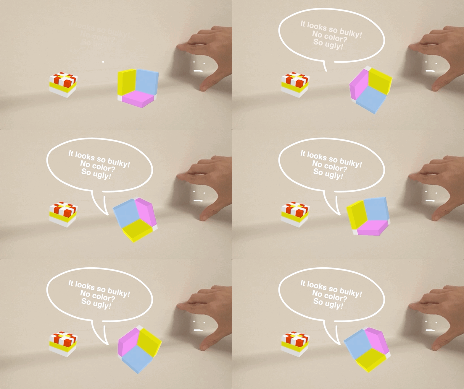
When other boxes are playing happily together in the ground, the shadow box can only watch them from a distance. Because it’s attached to the edges of the plain and can only stay in the corner.

3.gif

“Look at that weirdo! It’s so strange!” A red and yellow gift box whispered.

4.gif

“It looks so bulky, and it doesn’t have any colors! So ugly!” A tiny colorful box stared at the shadow box and said. “Look at us! Look how beautiful we are!” The colorful box spun around as if it was dancing Waltzer.

5.jpg

The shadow box was sad. “I was born this way, and I also want to make friends!” The shadow box cried.

“What if...I tried to change myself and be like them??” A thought came into the shadow box’s mind.

6.gif

The shadow box started to stretch its sides. “If I tried hard enough, I can get rid of these edges!”

The shadow box tried so hard that it didn’t even look like a box anymore.

“Come on…come on...COME ON!!!”

7.jpg

All of a sudden, the shadow box flew to the sky. It turned out the playground was just a computer screen. There was a much bigger world outside the screen. And the shadow box was never one of those 2D boxes. The shadow box didn’t only have shape, but also depth, and surfaces that reflect the light.

8.jpg

In this magical new world, there are so many other boxes that have shadows and can’t wait to be its friend.

(End)

Process

I animated the box with Final Cut PX.

I animated the box with Final Cut PX.

Week 5: New Metaphors, New Models

Redesigning Switch

Switch is the first game device that I have ever purchased, and it provided me the best gaming experience among all the other digital devices, such as PSP, PS4, iPad, etc.

https://www.nintendo.com/switch/system/

https://www.nintendo.com/switch/system/

I love Switch for it’s portable (light, thin), powerful (high-resolution, support big games), and can go beyond screens (ability to connect to 4K TV and projector).

But maybe it can be redesigned to be more powerful.

Idea generation card deck/toolkit

I looked through all the idea generation toolkit suggested, and I prefer SCAMPER.

SCAMPER is a mnemonic that stands for: Substitute. Combine. Adapt. Modify. Put to another use. Eliminate. Reverse.

Here’s my ideation process with the help of SCAMPER.

Screen Shot 2020-10-11 at 10.03.27 PM.png

1. Substitute:

Case Design

I love everything about Switch, but the back is kinda useless.

We can definitely make it more functional.

The back of the Switch

The back of the Switch

The back of the Switch only has a kickstand. It’s not super light and thin, not stable, cannot adjust the angle of it, can only be applied to hard and flat surface.

Screen Shot 2020-10-12 at 9.59.51 PM.png

2. Combine: Camera Lens

Switch is super powerful. But, it’s missing a camera lens.

With a camera lens, Switch will be able to take photos, track motions, and support AR. Here are my sketches of where to put the camera:

Sketches for Switch with camera lens

Sketches for Switch with camera lens

I downloaded a photo of the iPhone 12, and photoshopped the cameras on the back of the Switch:

Screen Shot 2020-10-12 at 10.47.23 PM.png

Here’s a rendering for the camera design on Switch:

Switch design.png

First, I added another kickstand to make it more stable. The angle is also adjustable.

I also added a 12 MP Wide Camera, a projector, and an Ultra Wide Camera. So that the Switch now is able to take normal photos, ultra wide photos, face recognition, motion tracking, screen projection, project mapping, AR, etc.

Screen Shot 2020-10-12 at 10.59.57 PM.png

3. Adapt: Capture and Project

Since now our Switch has all the functions that a regular iPhone would have, we are able to apply some mixed reality experience to this powerful device.

AR-Overcooked (AR Version)

Overcooked

Overcooked

Overcooked is probably one of my favorite games on Switch. It’s a cooking simulation game that support multi-players. In a local cooperative experience, players control a number of chefs in kitchens filled with various obstacles and hazards to rapidly prepare meals to specific orders under a time limit.

Screenshot of Overcooked

Screenshot of Overcooked

Now, since our Switch has powerful cameras and projector, why don’t bring this game to real life.

Photoshop characters inside a real kitchen

Photoshop characters inside a real kitchen

Rendering of Overcooked AR version

Rendering of Overcooked AR version

Players can hold Switches to scan the real kitchen environment and project 1:1 characters into the scene. Multiple players can connect to the same Wi-Fi to play together.

Rendering of the moving AR avatars in real kitchen

Rendering of the moving AR avatars in real kitchen

Screen Shot 2020-10-12 at 11.56.57 PM.png

7. Reverse: Motion Capture

In reverse of the experience of projecting 3D avatars to real space, why don’t we just put our self inside the virtual world?

Sketch for the Motion Capture function on the new Switch

Sketch for the Motion Capture function on the new Switch

Just Dance (Motion Capture version)

Just Dance 2020

Just Dance 2020

Just Dance is a dancing game that turns any room into a crazy dance floor. With Switch’s new camera function, it’s able to track player’s real-time actions.

Photoshopped Jude inside the Just Dance screenshot

Photoshopped Jude inside the Just Dance screenshot

Rendering of Just Dance Motion Capture Version

Rendering of Just Dance Motion Capture Version

Overall, I think Nintendo probably has already been developing a console with cameras, but they just haven’t released yet. Can’t wait for more immersive experience!

Week 4: Translating affordance

For this week’s translating affordance project, I want to create a physical filter/ portable photo booth.

Personally, I’m a big fan of filters. I love taking selfies with filters on. Sometimes, the filter is so cute that I wish it’s real.

I love filters!!!

I love filters!!!

So I decided to create a tangible one with the recycled materials.

Sketch

Sketch for a physical filter that can change faces by pulling the paper

Sketch for a physical filter that can change faces by pulling the paper

Since I don’t have enough cardboard to cover my face, so I am going to make a mini prototype for my Kaonashi toy.

IMG_5069.JPG

Recycled materials

The package of face mask and my model of the day—Kaonashi

IMG_5072.JPG

First step: make a paper helmet

I calculated the size of my Kaonashi’s head and made sure it fits.

IMG_5081.JPG

Second step: cut holes and make a cover & slot

The cover is to make the portable filter more like an all-in-one box.

The slot is for inserting different filters/faces.

Testing out the cover of the filter helmet

Testing out the cover of the filter helmet

Testing out the filter-changing slider

Testing out the filter-changing slider

IMG_5079.jpg

Third step: draw filters/faces

Here I designed two kinds of filters: one for changing parts of the face, and the other one for changing the entire face.

Testing out changing parts of the face

Testing out changing parts of the face

Testing out changing entire faces

Testing out changing entire faces

FINAL PROTOTYPE

Week 3: 50 Renderings

For the 50 Rendering project, I chose “box”to be my keyword. Because it’s such a basic shape and concept to start with in both 2D and 3D, and almost every great art and architecture build on it. I think it would be great to pay tribute to this fundamental object.

Personally I’m also obsessed with “box”, I also made a short film about the people who live in the box when I was in college. I used the “box”as a metaphor for social identities.

box in Sketches

1. The basic box in 2D; 2. A bunch of basic 2D boxes; 3. A 3D box in 2D; 4. A bunch of 3D boxes in 2D; 5. A box with depth in it;6. Color shaded box; 7. Red and white colored boxes; 8. Green slim boxes; 9. Cardboard box; 10. Looking down at an opene…

1. The basic box in 2D; 2. A bunch of basic 2D boxes; 3. A 3D box in 2D; 4. A bunch of 3D boxes in 2D; 5. A box with depth in it;

6. Color shaded box; 7. Red and white colored boxes; 8. Green slim boxes; 9. Cardboard box; 10. Looking down at an opened box;

11. Boxbot; 12. Fancy boxbot; 13; Box spider; 14. Floating boxes;

15. Juice box; 16. Pencil box; 17. Gift box; 18. Tissue box; 19. Treasure box; 20. Happy Meal; 21: Jack in the box; 22. Mario’s magic box.

3D Rendering

In IDM, we usually use software like Unity, Unreal, Maya, Blender, Adobe Dimension, etc. And we always started with a basic cube. I still remember how thrilled I was when I first turning them around and felt the power of 3D.

23 Animated 3D line box

23 Animated 3D line box

24 Pink shinny box in Blender

24 Pink shinny box in Blender

25 Red 3D box in TinkerCad

25 Red 3D box in TinkerCad

I came across this online 3D modeling website called UseCubes (https://usecubes.com/design), which is super user-friendly and easy to draw 3D object that builds on cubes. So I started to create more diverse structures of cubes to make up more interesting boxes in 3D.

26 Colorful brick box created by https://usecubes.com/design

26 Colorful brick box created by https://usecubes.com/design

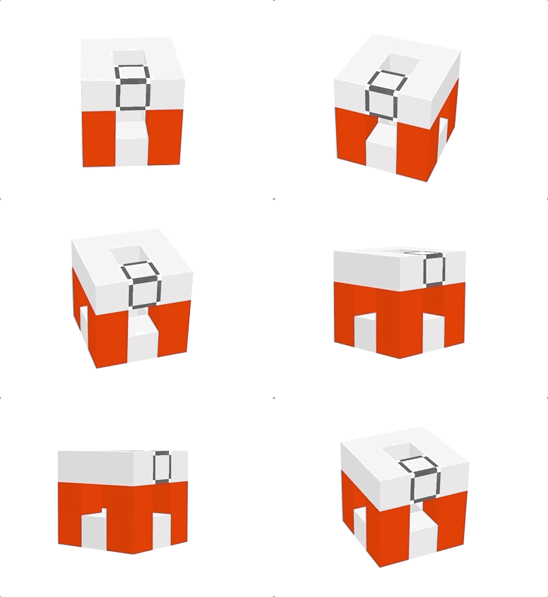
27 Red and white 3D box

27 Red and white 3D box

28 Basket box

28 Basket box

29 Futurist box

29 Futurist box

30-43

30-43

I was working late and saw my shadow on the wall. So I make the wall a canvas, and build a box with my hand and light.

IMG_5002.JPG

Shadow box

44

Almost twisted my fingers, lol.

IMG_5001.JPG

HAND BOX

45

Recycled materials

I went to the Toy Fair in New York couple of years ago, and the exhibitor gave me a box of plasticine. I’m surprised they were still in good shape, so I built a box like a toddler.

IMG_4984.JPG

Transparent box made of plasticine

46

I also used the recycled materials from last week to make some crappy paper boxes.

Cardboard box without glue

47

I used the pins to make a movable cover for this tube.

48 Tube box with a cover

48 Tube box with a cover

I also have a box of outdated name cards of mine, so I built a weird sculpture-like box without using any glue.

49 Abstract box made of name cards

49 Abstract box made of name cards

I also used books to build boxes.

50 Box made of books

50 Box made of books

This assignment definitely took me longer time than I expected to finish. But it was very fun to play around with the concept. I feel like as I was brainstorming for more ways of renderings, the idea of box was broaden, and the box itself was decomposed into shapes like square and structures like walls.

Had lots of fun!!!

Week 2: Endangered Animal

I came across this cute endangered frog called: Darwin's Frog.

And here is how it looks like:

Rhinoderma darwinii © Jaime Boschhttps://www.iucnredlist.org/species/19513/79809372

Rhinoderma darwinii © Jaime Bosch

https://www.iucnredlist.org/species/19513/79809372

Darwin's frogs were named after Charles Darwin who first discovered R. Darwinii in 1834 in south Chile during his famous voyage around the globe. The species have a distinct appearance, having evolved to look like a leaf, with a pointy nose.

The deadly amphibian disease chytridiomycosis has caused the extinction of Darwin's frogs. It’s been listed as an endangered animal since 2017.

And I happened to have pothos. It is also called devil's vine or devil's ivy because it is almost impossible to kill and it stays green even when kept in the dark.

My devil’s ivy

My devil’s ivy

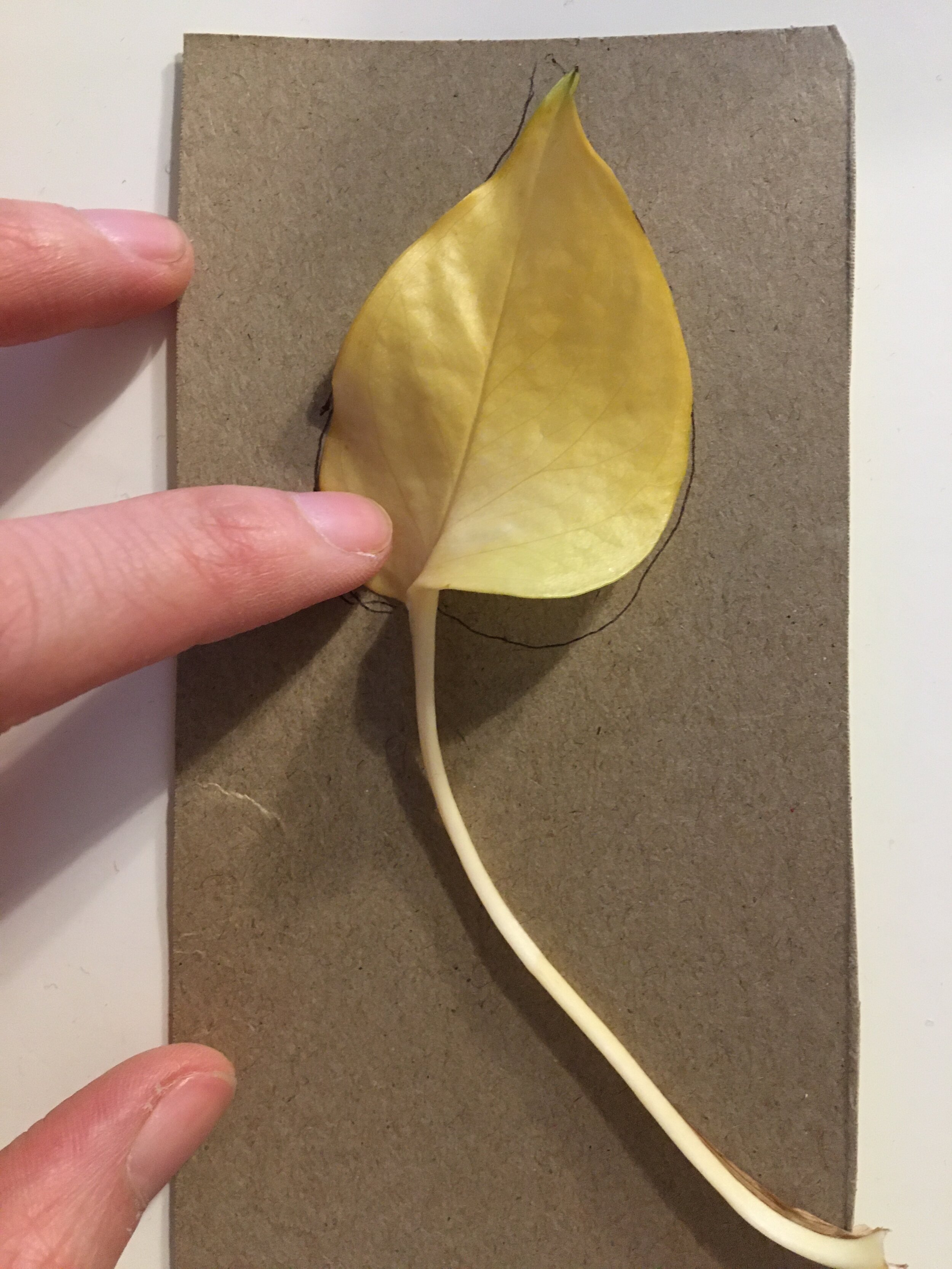
I hope that the cute Darwin's Frog won’t easily die like the Devil’s Ivy, so I collected some yellow leaves from my plant, together with the cardboard I collected, I am going to rebuild the frog.

Leaves of my Devil’s Ivy

Leaves of my Devil’s Ivy

The cardboard I recycled

The cardboard I recycled

I made some sketches to decompose the shapes and structure:

Sketches I made on modeling the frog

Sketches I made on modeling the frog

I then made a paper prototype:

Paper prototype of the frog

Paper prototype of the frog

I want to use the leaf to be its back, so I draw the shape of it on the cardboard:

Leaf on cardboard

Leaf on cardboard

Blueprint on cardboard

Blueprint on cardboard

The base of the frog

The base of the frog

Leaf on frog

Leaf on frog

Structures of the belly made by the trash

Structures of the belly made by the trash

And……Here it is. A very ugly frog.

And……Here it is. A very ugly frog.

There must be something wrong with the structure…Maybe I should make the body more like a triangle.

There must be something wrong with the structure…Maybe I should make the body more like a triangle.

So I changed the structure and made a new paper prototype:

2nd paper prototype

2nd paper prototype

The 2nd cardboard design

The 2nd cardboard design

The upgrated legs

The upgrated legs

The 2nd generation of frog

The 2nd generation of frog

IMG_4926.jpg
Group photoOk, now the 1st generation looks like a mouse…

Group photo

Ok, now the 1st generation looks like a mouse…

IMG_4932.JPG
IMG_4935.JPG

Week 1: Fantasy Device-Wearable filter

The fantasy device that could be super helpful at this moment would be a SMART FACE MASK that can transfer how it looks for different purposes. Of course it protects you from 99% of germs as well. It’s basically a “wearable filter”.

Basically, the surface of the mask is a wearable screen that’s super thin and can fit our face perfectly. It can show up any images/texture. Everything that you wanna project on your mask can be customized by a single App. You can type anything, add any images, change the base color, change how the material looks like, etc.

For example, when I am socializing with other people, I would love to show my friendly (or pretended) smile like this:

Face mask shows a smiling face

Face mask shows a smiling face

The material of the face mask will turn transparent and looks like nothing is covering our mouse.

The face mask can also show text, like a name tag for the first day of school:

Face mask that shows any text

Face mask that shows any text

It’s easier for teacher to take attendance and for new classmates to remember each other’s name.

You can also change the color into whatever you want and add any images or logos on it. For example a face mask for joining the protest without being identified:

Face mask changes color to black with a customized logo on it for joining protest

Face mask changes color to black with a customized logo on it for joining protest

The mask also has an auto-pattern detection function that can match up with your outfit. It can also mimic the fabric of the clothing. Like this:

The mask can auto-detect clothing color and patterns to generate something to match the outfit.

The mask can auto-detect clothing color and patterns to generate something to match the outfit.

Inspiration

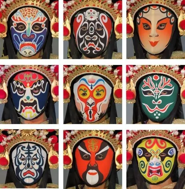
Inspired by the traditional Sichuan Opera Face Changing, the material of the mask is super thin, light, transformative, yet fitting the face perfectly.

In case you didn’t know about Sichuan Opera Face Changing, check out this video below:

“Change your face 10 times in 20 seconds! This is how it's done“-New China TV

Material

The mask is basically a screen and projector that is foldable and wearable.

Some existing wearable screens that could be taken into use:

1. Foldable screens

2. Wearable LED

Potential material in the future:

Other thoughts

We were thinking that instead of showing others how we look, we can also change how others perceive us. If the mask covers the entire face, it can also have eye tracking functions.

When two people meet each other, the smart face masks can auto detect each other. Mask A can show Mask B’s owner what Mask A’s owner want to be perceived as. Namely, instead of Mask A shows up an image on the mask, Mask B can receive image from Mask A and project to Mask B’s owner.

Instead of showing B an image on A’s mask, A send an image to B to project to its owner inside the mask.

Instead of showing B an image on A’s mask, A send an image to B to project to its owner inside the mask.